How some blogs demonstrate user-centricity by challenging long-standing best practices
Do you blog? How is your blog organised? What rules does it adhere to? Does it matter? Content is king, right? Right.
It’s hardly a secret that what reliably brings readers to your blog is your publishing consistency and content quality. To achieve these primary goals more efficiently, you should absolutely take shortcuts - especially when setting up and maintaining the blog itself. Templates are your friend. It’s OK to follow the call of the omnipresent ad for Squarespace (which is where this humble outlet is hosted).
(Can you hear the ‘but’ coming? Of course, you can. Here it is:)
But over the past few years, I’ve noticed that some of the blogs I enjoy coming back to have something in common. Besides a basic sense for readable typefaces and minimal layout, they also challenge and change some of the most basic defaults of how a blog works. This illustrates that even in exceedingly crowded spaces, differentiation through user-centricity is still possible. Below are my favourite examples.
Navigation
Click on ‘Blog’ in the navigation bar at the top. You’ll find a reverse-chronologically organised stream of content. Click on the post at the top (or maybe the one underneath) and start reading. This is how the vast majority of blogs you’ll ever come across is organised.
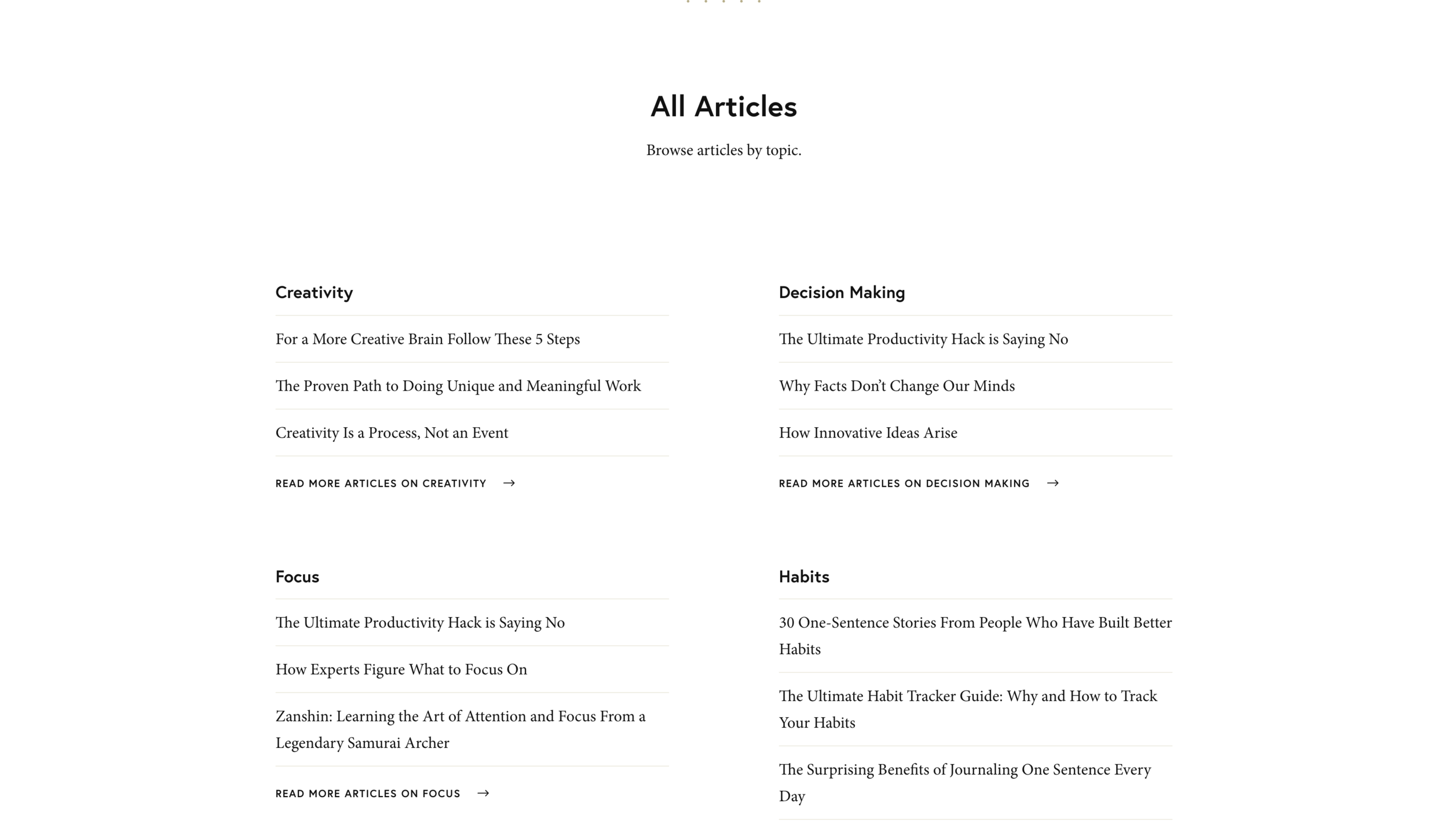
Enter James Clear, author of the bestseller Atomic Habits. Visit his blog, and what you’ll see is a grid of his best posts ordered by category.
Furthermore, click on any category, and you’re led to a dedicated page where all relevant posts are expanded to their complete form. These posts are not sorted by publishing date but arranged to tell the best story - much like one would organise chapters in a book.
The sidebar doesn’t offer navigation to the “next” or “latest” post but other categories. (What? It’s like this guy doesn’t care about time at all.)
As a reader, I find this way of organisation helpful since a blog is a great place to read up on a given topic. This one doesn’t make me scroll through an endless stream of less relevant content. And if I want to be connected to James’ latest thinking in a time-based manner, I can still do this by signing up for his newsletter.
I can only speculate about why he organised his blog this way, but I suspect it has to do with the goal he wants to achieve - which isn’t getting high clicks and read metrics for his blog (which he doubtlessly has), but to sell books. This is best achieved by demonstrating the high quality, relevancy, and cohesion of his writing in general, not by making you read a large volume.
Giving it away
The copyright notice in a blog’s footer is so ubiquitous, it comes already baked into most templates. Proud of our content, we rush to add our names and the current year to it with only the vaguest idea that this might provide some level of protection against others stealing the precious fruits of our labour.
Well, let me tell you that, firstly, it doesn’t. Since copyright over a piece of text (or any content of your creation) is already yours from the moment of its publication, you cannot lay additional claim to it by placing one word or Ⓒ-symbol in your footer. Also, the internet doesn’t care what’s yours.
More importantly, there is another way: Visit Leo Babauta’s popular blog Zen Habits, and you’ll find that he’s not only removed the copyright notice but replaced it with one that reads ‘uncopyright’. This then links to a page that explains the concept. Here you’ll learn - in a nutshell - that if someone steals his content, it isn’t stealing but sharing. And sharing is better for everyone - the reader, the reader’s reader, and the original author. Here’s one paragraph from this page where he explains how uncopyrighting doesn’t hurt his revenues:
[Counter-argument] 2. You’ll lose ebook revenues. If people buy my ebook and then distribute it to 20 people, and each of those distributes it to 20 more, and those to 20 more … I’ve lost $76,000 in ebook revenues. Perhaps. That’s if you agree with the assumption that all those people would have bought the ebook if it hadn’t been freely distributed. I don’t buy that. In this example, thousands of people are reading my work (and learning about Zen Habits) who wouldn’t have otherwise. That’s good for any content creator. Also: I’ve made more money since releasing copyright, by far, than when I had copyright.
Shutting your blog down - occasionally
One rule of blogging: Try to get as many clicks as possible. From anywhere. Anytime. That’s what makes blogs successful, right?
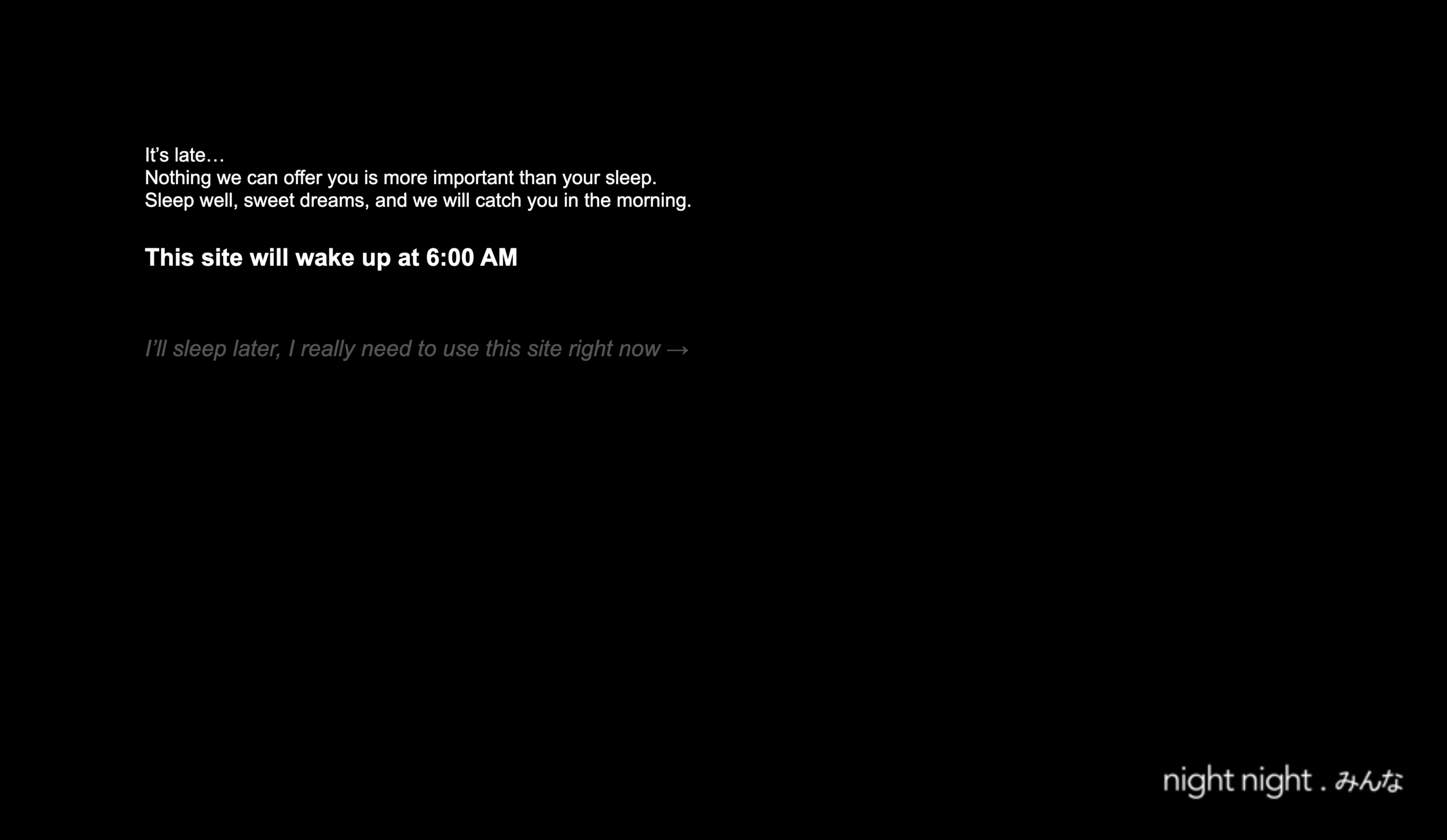
At this point, we’re all painfully aware of the adverse effects that excessive exposure to computer screens and other technology has on our mental state. To combat this, Masamichi Souzou and Neeley Worldwide have created a simple script called nightnight.みんな, which anyone can add to their website - to put it to sleep between defined hours.
https://www.nightnight.xn--q9jyb4c/details
Blogs fitted with this script gently nudge their visitors to go to sleep themselves. In doing so, they again demonstrate respect for true user needs. At least I like to think that way, having instituted a sleep period from 10 pm to 7 am on my own blog. And in case you’re wondering, no, I didn’t notice a permanent decline in engagement in my website analytics (How much attention are you expecting from visitors who happen upon your blog in the middle of the night anyway?).
*
I am not advocating for blogs to be willfully shaken up to become demonstration platforms for gimmicky plugins and features. This will only make it harder for readers to engage with the content. However, a few thoughtful diversions from the defaults of your template can illustrate that you’ve thought about your readers and creatively explored ways to provide more value to them. Ultimately, this will help you better achieve your own goals too.
If you’ve come this far, thank you! I’d also love to learn about examples of blogs with a difference you’ve come across - please share them. I will update this article to feature them as they come in. ✌️


